Greetings, Project Runway JUNIOR Fans!
Let's cut to the chase right here and now. NO ONE IS ELIMINATED THIS CHALLENGE.
I've got a theory on this, which I will share at the end. For now, let's dive in.
 |
| The button bag means TEAMS! |
 |
| Tim met the teams with Mimi Goodwin, representing Simplicity Patterns. |
Mimi G. is a blogger and pattern designer for a Simplicity collection that offers modern, streamlined outfits in a variety of sizes. They should do this for the regular designers, only team them up on a "real woman" challenge, since Mimi does a lot of plus sized patterns. She'd be an excellent judge!
The challenge was to pick one of the following decades: 1940's, 1950's, or 1960's and create a five-piece, updated collection. The winning look would be reproduced in a special, Project Runway Junior pattern for Simplicity.
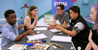
Each time had time to deliberate before sending two members off to Mood for fabrics.
 |
| Sometimes the communication worked.... |
 |
| ....and sometimes it didn't. |
Team 1960's struggled the most. They hadn't discussed fabrics and colors and when Peytie and Samantha went to Mood, they aimless. They didn't even check to see if the colors matched or what type of fabric the designer wished to work with. It was a disaster.
And after they returned, nobody on 60's was satisfied with their fabrics. They went back to the "Mini Mood" twice for fabrics, starting from scratch each time.
I know how the team thing works. The worst look from the losing team gets sent home. However....the worst look this week clearly came from the winning team. The worst look from the losing team was a complete toss-up.
Team 1940's
Team 1940's was the winning team. They were more cohesive and the garments were better made, according to the judges. I thought both teams were neck and neck in both departments. What Team 40 had that Team 60 didn't was a "wow" moment. That was it.
Maya
Maya did a totally uninspired cropped top with a gathered skirt. What this heralded from the 1940's was beyond me.
Zachary
This was a very innovative outfit, from top to bottom. Why it received no mention from the judges was beyond me. The challenge was to UPDATE a look from the 1940's, correct? I did hear the UPDATE word clearly mentioned. This one, to me, filled the brief completely and it would have been a winner for me. Simplicity could have given the sewer options with and without the back hole and both would have been fantastic. I WOULD HAVE BOUGHT THIS PATTERN. I need that top in my life. Zachary, if you're out there, could you shoot me the pattern? kthnksbye.
Jaxson
Jax, you're cute and adorable and stuff, but that top was a disaster and that skirt wasn't much better. You would have been sent home had there been no benefits to being on a winning team. Seriously, dude, you sewed that outfit up to the last minute?
Zach
Good lord, WHAT is that outfit doing in a competition like this? It seems that in every competition, one outfit walks away with the competition. This should have been that outfit. Zach, if you're out there, THIS SHOULD HAVE WON. YOU WERE ROBBED.
Nothing says 1940's more than a peplum, so if you wanted to update a 1940's look, you'd pair it with a knock-out pant, wouldn't you? Who wouldn't want this for the holidays RIGHT NOW? I would. Zach, feel free to shoot me this pattern as well, please! kthnksbye!
Bridget
 |
| "What I like about it is that it looks like a nightgown. It's so chic. You could wear it anywhere." |
OK, Kelly. WEAR IT SOMEWHERE. You could fit into that. I want to see Kelly Osbourne wear this dress somewhere and look chic.
Seriously. The ghost of Norma Desmond should come back and haunt the dreams of anyone who dares to wear this in public. Where do I begin....
Let's start with the skirt. There were a number of Simplicity patterns to look at and I've made my share of 1940's patterns. The style was not to gather the bodice, skirt AND the waistband. That's too busy. This garment needed s stronger, geometric line--wider gathers in the bodice, a clean waistband, and even gathers in the skirt. The long, bat-wing sleeves gapped the bodice open at the neckline. The dropped neckline was the only updated aspect to the garment. For me, that's where the garment completely failed. The one aspect that updated it was awkwardly constructed.
This was the winner, so Simplicity corrects all those problems AND offers a short look and a long look.
Despite all those mean things I said....congratulations, Bridget!
Team 1960's
Peytie
It's a cute dress. Nothing tremendously inspiring nor is there anything tremendously up-to-date about this. Peytie was our reliable hippie girl and she phoned this one home! That's what you get for not asking questions of your team mates up front before you go to Mood!
Jesse
Properly updated for today's style of color blocking....still kind of safe and not extremely flattering or innovative. A snooze.
Samantha
Gosh, Sam, you nearly went home. I might have sent you home as I was not fond of the jacket AT ALL. Sorry. I thought the pockets were unflattering and made the model look frumpy. A "Channel-styled" jacket is really hard to pull off. This one flopped around the neckline and the 3/4 length sleeves added to the frump. You didn't finish the dress underneath... but who's fault was that? You and Peytie were sent to Mood and your Mood fabric survived the cut when the others' didn't. So you only had to scramble back to Mini Mood once. I'm not feeling as charitable as the judges!
Matt
Jax thought Matt's Babushka looked matronly. I thought the scarf was inspired. That was they only thing, however. Once again, Matt made another, tired cropped top and another pencil skirt. And no, it wasn't THAT well made. Why the white in the back? That just looks cheap to me. It also looks like it was sewn in one or two hours---which it probably was.
There's no color. No fun. That print that he used for the scarf should have been used in the outfit. And yes, that skirt walked in from 1952, only we heard that skirts were rising so we raised the hem. Anyway, where is she going with that bared belly and business skirt with a scarf on her head? I know where Matt should have been going....HOME, that's where! Only the judges were more charitable this week.
Maya


No comments:
Post a Comment