Season 12 was certainly something else. We went from the ridiculous

to the sublime.

What a journey it's been!
I can't recall a season where all four finalists were so evenly matched in talent, creativity and skill. It was, indeed, a hard decision for the judges to make. Let's see the show.
Bradon
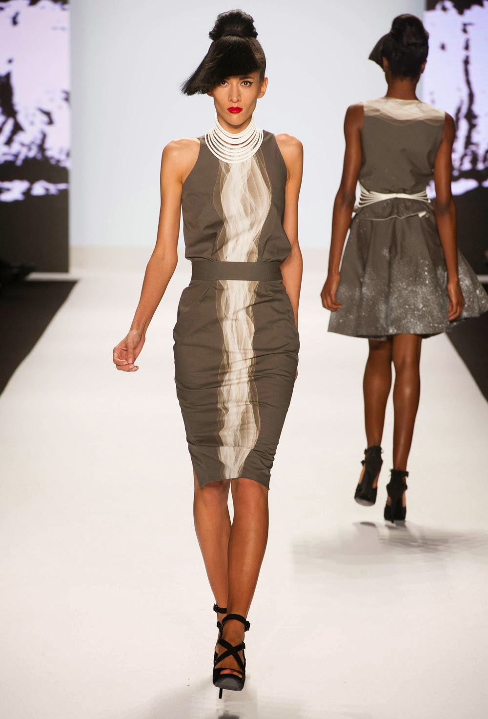
Throughout this season of Project Runway, Bradon was the man to beat. He was a master of a variety of techniques and seemed to be able to pull together the perfect outfit for most of the challenges. But when it came to the runway show, although he pulled out all the stops, there were too many themes and no, clear consistent vision.
Painted fabric motifs
 |
| Gorgeous dress. Real high point, but fabric choices were a bit disjointed. |
 |
| Stunning shorts, but in this outfit, the hand painted top is lost. |

Colorful prints
 |
| I loved the print of the pant. Very evocative of art nouveau. The top, however, seemed a bit disjointed. It was as if he was trying to throw metallics in just because they were in this year. Or perhaps looking to find something that could go with the pant, cause excitement on its own, yet not compete. |
 |
| Again, another stunning print. The dress showcases the print nicely, but there's no real innovation. |


This print is way more subtle. Considering these were the only two outfits with it, tossing them in here seemed more like "here's some fabric I really liked" rather than "here's another chapter to the story." It was a real missed opportunity. The pouf on the sleeve of the gown ruined the easy line and added unnecessary bulk.
Let's throw these in there for good measure....


Both of these belong somewhere else and not in Bradon's Project Runway finale runway show.
During the season, Bradon more than proved that he is an exquisite technician and keen problem solver when it comes to answering a design or client brief. What he lacks is good editing skill and real focus. That will come with more experience. He was one of the strongest designers and best competitors this year. Should he have another opportunity to show at Fashion Week, let's hope he's fueled by a very strong vision.
Justin
Justin endeared himself to the fans this season with his sweet nature and fierce determination. Overcoming deafness is challenging. Deciding to re-enter the world of the hearing with a cochlear implant is incredibly risky and disorienting. This was the story that Justin told in his collection. What resulted was completely unexpected as he had not shown this level of design focus during the competition.
The Waves


The Dissonance
Sound is part perception of the wave and part interpretation. It's common for cochlear implant patients to hear nothing but noise and static until they learn to recognize what each sound means. This process will take years. While a normal hearing person will occasionally question what a certain sound will be, a recent hearing-acquired person will do it quite frequently. The wave print and the splatters represent the dissonance.


Beautiful dress, indeed. Clever use of the 3-D piece at the waist. It would have been an nice, unifying element had another outfit had a waist piece.

This was my favorite of the three. It would have been nice to see a 3-D belt instead of the fabric belt. The 3-D neckpiece is lost at the top.


The cute vest was totally ruined by the 3-D element. It would have been better at the waist. The wave print would have been more effective on the back of the vest.
Had Justin sent these out in order (and you can see the order from the garment in the background) this series would have made more sense. The one dress without the splatters should have come out third to show the evolution of the understanding of sound.
Still, I question how effective the wave print and splatters were, visually. The splatters were really distracting and to me, seemed like one visual element too many. Also, only the sheath dress in the middle effectively used the wave print. On the other two outfits, it seemed like an after thought.
Layering
While not telling the sound story in any overt way, Justin did use layering quite effectively. Layering is very on trend, but most of the time, it's just putting one garment over another. As someone whose primary sense is seeing, Justin created layered garments that played eye tricks with the viewers. To me, this was the strongest part of his show. Had every design featured this element, it would have been more cohesive, more effective and he would have made the judge's final decision even harder. The world needs to see more of this from him.


Those aren't cut out circles. Those are the result of an arch shape over a U shape. They come together to form the O. I thought the second outfit was way more effective than the first. There is so much play with positive and negative space. I could look at that outfit all day. It should have been his muse piece.
The Exquisite Joke
Most designers sent out stunning, visually arresting unconventional materials pieces. Justn's was the only one that caught our attention by sound.

Made from hundreds of little, glass laboratory pipets, it tinkled softly down the runway. Despite the music blaring, everyone could hear the sound of the dress. Every pipet caught the light so beautifully, too. The effect looked like the most luxurious fringe you've ever seen. It was a dangerous dress to wear with bare hands and sandaled feet. The model presented it beautifully.
Justin was thrown a softball and he knocked out it out of the park. While his show had its shortcomings, it's strengths were overwhelming and memorable, which is the very least you want to do with your shot at Fashion Week. Justin LeBlanc has arrived, he has a voice and the world can hear it.
Alexandria
After her season on Project Runway, we expected nothing less than a very cerebral collection from Alexandria and she didn't disappoint.
 |
| In the tradition of paper dresses that have walked the runway before, Alexandria's phone book dress had sass and style. She even made a hat, for cohesiveness. But in contrast (clearly intentional) to the rest of the show, it was an extravagance the other garments didn't have. |
Alexandria's collection also featured layered garments. The shapes and proportions were constantly in play.


This was her muse piece. The pants were slightly dropped at the crotch. The effect is easy and looks incredibly comfortable. This is modern sportswear.


Again, another easy-to-wear pant. While the gathers might not look great on a wider waist, they look good on the model. The jacket is very flattering and could be worn by a wide range of people.
Wrapped Pant
I'm obsessed with wrapped pants. A tied version of the wrap was popular in the 1930's as beachwear. Alexandria's is more tailored.

I would have liked to have seen a full length, straight legged version of this with a shorter jacket, just to show a wider range of options with this pant. I'm convinced that a wider waisted gal could wear this, with the correct proportions. But Alexandria was too wrapped up in her specific vision to experiment with the pants. I do think, however, that if she put some time into this, she may have a real innovation for the future. She's got the technical prowess to do it.
Modern Separates


The black outfits seemed completely out of place in the shades of cream, white and grey. However, the design elements were very consistent.
Less Successful Dresses
Unlike her unconventional dress, these two dresses really had nothing to communicate.


Yes, they had some edginess to them, but it was had to imagine the same woman who enjoyed the easy, casual nature of the daytime pieces suddenly opting for such fussiness at night.
It's clear that Alexandria has incredible technical and design skill. She should take a handful of her ideas with pants and layering and dive into those with gusto. There are certain catalogue companies that have made a cool fortune selling too-simple, over priced, under designed clothes for women who don't want to fuss. They end up looking like vagabonds. Alexandria takes the notion of comfortable, easy clothes and gives it a thoughtfulness and tailoring you rarely see. These are separates that could easily fit into the workplace of the future, as we become more casual, yet find new ways to communicate competence and professionalism.
So I recommend that Alexandria move beyond the "punk" and the "cool" (because, let's face it, it's easy to dress very young women) and give some thought to the future of working women everywhere. More and more, they are entering non-traditional fields. They are collaborators and networkers. Designs for these ladies need to be comfortable, welcoming, a bit androgynous, but always interesting. Alexandria has the intelligence to do this and make a real, lasting name for herself.
Dom
As I was fond of saying all season that Dom was a solid sender. Challenge after challenge, if she didn't win it, at least she was highly successful. She rarely stumbled and presented herself as one of the most consistent designers. She did it with a warm and friendly attitude. How she stayed so positive throughout the competition is beyond me. She must have nerves of steel.
Wizard of Prints


This was my least favorite of the looks. I loved the jacket, however. I think she knew that dress underneath was not the best and that by pairing it with the jacket, she'd save it from complete attack.


Negative Space
Dom also had some fun with negative space, both with fabric choices and design choices.


The judges raved about the sheer plastic detailing. It was an inspired element as it added silhouette interest without adding bulk.

The judges didn't really appreciate the bathing suit. I think Dom missed an opportunity to showcase some more of the clear plastic fabric, which would have provided a more sporty contrast to the formal garments in the show.
Design Elegance


Dom thoughtfully integrated her unconventional materials piece, which was made from screening and door hinges, with her show by creating a very elegant sheath dress.
This show wasn't perfect either. I would have liked to have seen another pant. We know that Dom can make them. I would have liked to see separates. We know she can do that, too. Still, she completely played to her strengths, kept it interesting and presented a snapshot of a modern woman from the South, which is what Belk Department Store wanted all along, was it not?
So Dom is the winner of this season's Project Runway.
I'm going to take a blog vacation from Project Runway All-Stars during which I'm going to expand the subject matter of my blog. I'll return for the next regular Runway season. Until then, pop in sometime to see what I'm up to!