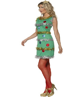
Due to an illness that I've been battling, I'm going to give you back-to-back recaps. We start off two episodes ago with an unconventional materials challenge. Usually these challenges are fun and disastrous. This one sent our designers to some sort of Christmas shop that sells holiday decorations 365 days a year, where they were to get materials.
So you're thinking...great! It's almost Christmas, let's bring on some holiday spirit!
Well, you'd be mistaken. No, our designers were instructed not to use the materials in an obvious way. So without any further ado, let's dive in.
Ivy
Ivy went straight for a conventional dress. Let's just ignore completely that she committed the biggest sin in Project Runway unconventional materials challenges: never seek out fabric to replace the fabric. After all, the judges did. Where's Heidi and Nina and their long-term memory when you need them?
So focusing on the garment....keyhole detail at the top, fringe bottom on a drop waisted skirt. Monochromatic scheme...it was all supposed to add up to a sophisticated look. Instead, it looked cheap and boring. The proportions seem off to me. If you're going to drop the waist, you need to leave the natural waist zone. Dropping it just a bit does nothing but make her model's tummy look big and her waist look even bigger. If you drop the waist to the hips, you need to drop the hem a bit as well.
Furthermore, cutting the model straight across the top did nothing for her bustline. So the keyhole looks like an out-of -place afterthought. The sleeves look wrinkly and puckered, too.
Ivy got quite a bit of judge praise for wearability (if you're not picky about fit) but this was not an outstanding outfit. It did have a real 1920's, flapper era-feel, however. It would be a shame if the next challenge was a 20's challenge.
Emilio
Once again, Emilio seemed convinced he'd win.
Blessedly for him, he was safe this week, otherwise, we would have gotten to hear Isaac go on and on about how this looked like a foil-covered lampshade.
Laura Kathleen
Really, it's not a bad little dress. It just needs a little love.
the only down-side of this dress was the poorly placed shiny blue doo-dads on the front and back. They were too random. Random might be fine in modern art, but it looks cheap in dress making. It's a shame, though, because her instincts were right on this one. It was a fine dress otherwise.
Anthony Ryan
This was the first of two, nearly identical dresses that evening.
Only this one had more mirrors and kind of a funky back. It just looks like stuff tacked on for no good reason and the shiny blue mirror-tile just give it an extra tacky factor. There is too much tacked on around her neck. It looks like the dress is trying to choke her in the front and then give her two pats on the back to move her along.
Weird. I actually like the shiny blue tile and wish he had more of it. To do a dress in mostly tile with a few fru-fru embellishments might have been stunning. I guess we'll never know, will we?
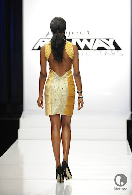
Uli
Somebody had to win this challenge. This week, it was Uli's turn.
Her design is kind of a cross between art nouveau and rococo. Once again, Uli brings doo-dads to a knife fight and comes out on top. I prefer the dress on the back to the one in the front, however.
The dress in front looks like armadillo scales to me. And what's with the codpiece in the front? The back had a sort of bluish hue to it that set of the gold. It also seemed a little less scaly to me as well. I think that color combination would have looked much less holiday-like than the front. That said, this design, too has an art-deco feel to it....it would be a shame if the next challenge had that element....
Joshua
 |
| Joshua needed the power of prayer this week.... |
I've given you the extra large version of this picture so that you can see the top. Those are trains on her shoulders. TRAINS THE THE SHOULDERS! I wanted to give him the win for trains on the shoulders! From the bustline up, this outfit is pure genius with the exquisite care he took to piece together disparate stuff to come up with that mosaic. It was amazing.
The bottom, however, almost earned him the boot this week. It was seriously lazy. Considering the amount of time he spent on the bottom, it should have looked better than it did.
The chevrons don't exactly match up, front or back. The washers or whatever those were that hung from the waistline seemed like a last minute add-on. Why feature an intriguing blue line at the bust on a top that has blue scattered about AND NOT USE IT ON THE BOTTOM? He saw green and yellow at the top and I see more blue, yellow and red.
It's a shame that he didn't buy more blue ribbon or whatever it was. He could have made a skirt and given it some side treatments of the same mosaic in the top. That way, he would have had both flow and continuity.
My Joshua, you could have won this challenge. Your editing and taste levels are off this season and you need to bring it back under control.
Casanova
I think I'll miss you most of all.
 |
| "I struggled so much on this outfit." |
 |
| "It looks like the outfit fought back, too. I declare it a draw." |
The bodice was an interesting braided coil, which extended to the sleeves and down the back. The bottom was a combination of a light yellow center overlaying pleated sides. Only, the pleated sides looked crumpled, wrinkled and uneven. The overlay looked like it was pulling the side pieces together weirdly in the front. There were too many elements competing for attention here and it was another example of excessive use of fabric in an unconventional materials challenge.
So our pal, Casanova was given the boot. I weep.
But wait....there's more!
I don't know who was planning this season of Project Runway All-Stars out, but if you're going to do an unconventional materials challenge at a Christmas store, wouldn't you think that you should put that on the week before Christmas? No? Then you must be a Project Runway All-Stars producer!
For some reason, the episode airing the week before Christmas was devoted to the Roaring 20's!
"It is the era when modern fashion was invented." - Carolyn Murphy
Later, this same woman would actually say that "shows like Downton Abbey" have made this era so popular. Downton Abbey was set in the Edwardian era, pre-20's. She made that statement wearing a dress like this.
She's totally off by 10 years (later) with hair and dress style. Later, Isaac Mizrahi, who does pay attention to the fashion history timeline, called a designer out on the same thing.
This week's challenge was a face-off challenge in which two designers got the same event, either a garden party, a soiree or a speakeasy. I would have preferred mob funeral, since Gretchen Mol from Boardwalk Empire was one of the judges, but they didn't offer that.
So why not harken back to that bygone era with a group of designers who have absolutely no reference to it and see how they do, shall we?
Uli
Why, Uli, why did you choose to cover your model's dress in a shrug that just weighed it down? The dress was quite lovely, underneath. You could have been a contender. The long back/short front look is hot on the runway this year. The full fringe in the back, little fringe in the front plays with the fringe notion while not being completely referential. This could have been in the running if that shrug hadn't thrown the whole look off.
Also, the model's hair does nothing to reference the era. Was that intentional?
We'll get to her face-off partner later.
Emilio
This was actually one of my favorite dresses of the challenge, but Isaac was right....
That gal is going to a garden party in the 1930's...maybe even the 40's. The lace insets in the back are thoroughly modern and straight off the runway. Carolyn found them charming. I thought they were very poorly done and the least favorite part of the dress. Why do designers feel compelled to add things to a dress when they are clearly not needed?
This is another model that was not styled to the era, hairstyle-wise.
Ivy
I see what Ivy was trying to do here, but she fell a bit short. The dresses in the 1920's, except for a brief period of time around 1926-27, were not that short. In fact, many of them featured an underskirt that extended below the hemline of the main dress--a throwback to the Edwardian era as one era slowly morphed into the next. However, that would not have been done with such heavily beaded fabric. In the end, the chevron pattern never matched up and the whole look was so weighed down.
Joshua
I'm going to shock you all and say that Joshua should have won this challenge. This dress was far from perfect, but it was exactly what the challenge called for: update a 1920's look.
It's beautifully draped. It's got that uneven hem that's so hot on the runway today. The mix of colors is fresh. The only complaint the judges had was the broach and handbag/shoe combination which made it look dowdy. You may beg to differ with me, but I'm about to show you this week's winner. Maybe then, you'll agree with me.
Anthony Ryan
I don't understand how this is modern and not too referential. I don't understand how Uli's lamé shrug was too heavy, but the feathered shrug was just right. I will say that it is beautifully constructed and styled. Also, the model's hair looked more 60's than 20's. So perhaps Anthony Ryan was updating the 20's....to the 1960's.
Laura Kathleen
Again, lots of good ideas here...just some really bad execution.
Eschewing feathers this week (since she used them before) she opted for fur. The result also weighed her model down unnecessarily. She couldn't even deliver a convincing story about how a gal on the way to the soiree might need to cover up because the arms are completely exposed. Now unless this flapper shops out of the L.L Bean catalogue, I doubt she had any use for a sleeveless vest. That comes ten years later in the Depression when dry rot causes the arms in her fur stole to fall off, but she hasn't any money left for a new one.
Laura Kathleen wasn't afraid to go back to Diane von Furstenberg's beloved "palazzo pajamas." Palazzo pants were revolutionary in the 1920's but didn't really take off until the 1930's and even then, were more for leisure wear than fancy evening wear. But since we're not actually paying attention to the era we chose to reference, let's ignore all of that, as the judges did.
Laura Kathleen pleated the sides of the pants and I know what she was trying to do here--bring an element of streamlining/deco to the pant. However, the pleats billowed out on the runway. It wasn't a flattering look. Worse than that, the top was droopy and not very memorable.
And so we say goodbye to Laura Kathleen, whom no one ever understood or got to like, except Diana von Furstenberg. And if have to choose, I choose DVF!
Until next challenge, enjoy whatever holidays you celebrate this time of year!


No comments:
Post a Comment