"Marie Claire?"
 |
| "Mary Clare!" |
I'm sorry, Heidi. That would be wrong. Designers? Hit the buzzer when you come up with something.
 |
| "Isn't it Mary Clare?" "I dunno, I just pronounce it the way Nina pronounces it." |
 |
| "It's Mary Clare. Everyone knows that." |
 |
| "But 'Ma-REE Clare' is kinda awkward...This quiz is SO HARD!" |
No it's not, Dom. It's quite simple. If you want to be traditional, pronounce it how the French would. Couture is often pronounced like the French word it is. This week, a designer said the word "bouillir," the French word "to boil" to describe a sewing technique that he was using. Why?
A little history, perhaps....
Marie Claire was originally published in Paris by Jean Prouvost and Marcelle Auclair in 1937, only halting publication briefly after World War II. The US edition started in 1994 and is published by the Hearst Corporation.
So you have two choices when pronouncing the name. You can pronounce it like the French do. Here's how they pronounce "Marie." Or, you can do it American style, which would be "me-REE."
For a bunch of fashionistas who sweat their pronunciations of Monique Lhuillier and Yves Saint Laurent, why play fast and loose with "Marie Claire?"
This week's challenge found Tim and the designers in the closet.
 |
| "Welcome to Mary Clare's shoe closet!" |
 |
| "Let me give it a moment of consideration. No. I risk physical torture from Nina Garcia should I change that pronunciation. I'm sorry. I'm stymied to change." |
This week, while the Belk executives, feeling forgotten and forlorn, drank themselves silly in Charlotte, NC, we swam in Lake Marie Claire.
The designers got to pick shoes from the closet.

No designer names were mentioned, likely out of courtesy to Belk, but possibly because no shoe designer wished to be attached to the garments that were about to be produced. It's a shame. I was watching the looks on their faces as they read the labels.
The challenge, of course, was to produce a garment inspired by and complimenting the shoes.
Before we dive in completely, a heartwarming moment from Mood Fabrics....
 |
| Swatch: "I hear you have shoes. I love shoes. Let me chew the shoes. Can I chew the shoes? Come on, buddy, be a pal." |
Karen

Karen surprised us all this week by not only producing a garment with a waistline, but a garment with an EXPOSED waistline! Of course, to be safe, she topped it off with a completely shapeless jacket and as a result, she ended up safe. It does a good job of turning the shoes into an integrated design element of the outfit.
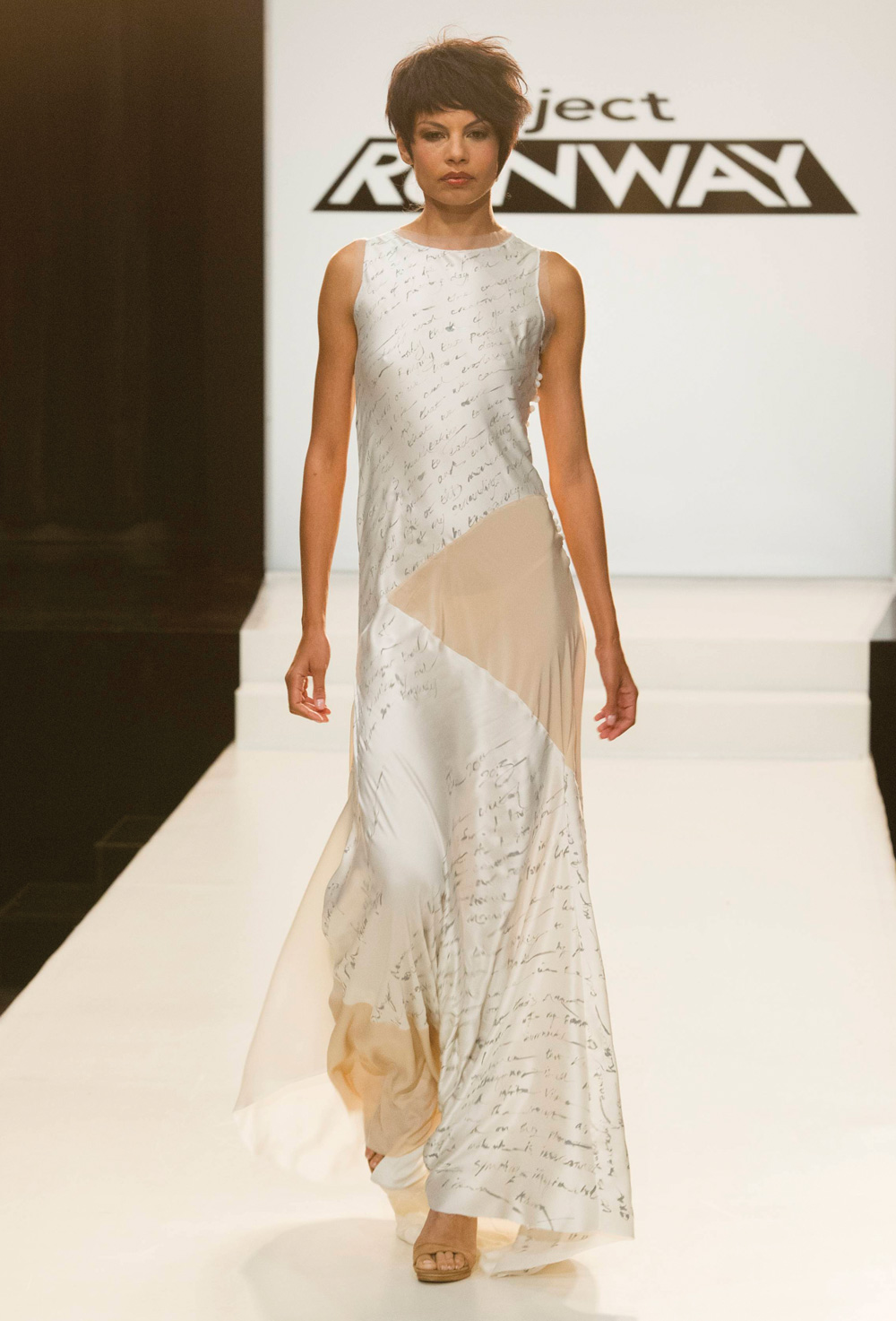
Kate
What happened to Kate this week? She picked the most stunning shoes on the wall.

Kate
What happened to Kate this week? She picked the most stunning shoes on the wall.

The outfit she designed was supposed to reflect the surrealist nature of the shoes. Instead, everything ended up simply looking sloppy.
My eye was instantly drawn to the crooked placket and collar of the blouse. Was that intentional? The sleeves had all sorts of embellishments that just got washed out on the runway. Instead, you just saw weird seaming. The skirt added nothing to the outfit and distracted the viewer from the amazing shoes. I think she had the right instincts about using the shoes as the only pop of color. I just wished the outfit had not been so complex. She needed a more simple visual statement so as not to distract from the shoes.
 |
| The shoes are not the first thing you see... |
Justin
Justin's shoes, shown in the lower right of this picture, had a multitude of colors.

Rather than pick one or two of those colors, or pull the checkerboard or stripes for a trim, he chose to do an all-black piece.

Considering the way this turned out, it was probably for the best. One more embellishment on this would have knocked him out of the safe zone. I'm not fond of the bunching around the hips and thighs. Only a model could wear this outfit.
Alexandria

Alexandria, last week's winner, so confidently picked the gladiator boots with knee pads. She so confidently designed a dress with lace inserts--emphasizing the contrast between hard and soft. The judges loved it.
To me, the dress looked sloppy and cheap. Lace inserts are all the rage these days. This reminded me of t-shirts in the juniors section that you see with lace inserts and gobs of glitter. Hard and soft isn't the only contrast that could have been done with these boots. You could have done a contrasted the wild boots with a conservative suit or well-tailored dress. That might have been her key to another win. I just don't think with the time allotted, Alexandria felt she could be that ambitious. Her aesthetic involves complex shapes and silhouettes. She went for the simple and nearly got the win. But in the end, as celebrity judge Kaley Cuoco said...

Dom

Dom continues to impress me, week after week. She chose some old-school kicks and highlighted all of the colors. Both were bold, unconventional choices. What kept her safe was that she used a quilting effect on the fabric, which unnecessarily added bulk. These were shoes that were really calling out for separates, in my opinion. Had Dom designed a cute jacket/shorts combination, the judges may have embraced this more warmly. She did the best with her time constraints, however, I worry that without feedback from the judges, she may turn to this quilting technique again. As we will see, this was not the challenge in which to trot out your fancy sewing techniques.
Jeremy
Jeremy's starting to grate on my nerves. He's overconfident about his design skills. He chose the boots, but instantly began talking about the sewing technique he was going to be using as if this weren't a challenge focused on the shoe. I believe he would have done the "cable knit sweater out of chiffon" regardless of the dictates of the challenge.

The judges saw "Pretty Woman." Wrong movie. Think "Flashdance." The top was a mess of poorly sewn "cables" and weird knit trim.
Bradon

Bradon chose a glittered, beige peau de soie flat. It inspired him to use a "bouillir" technique which drapes fabric in a way to make it look like boiling water. The same technique is used on the silk lining of casket and Liberace's capes. He was going to do an entire dress with the bouillir, which would have aged the model about 20 years. Tim talked him out of that. I was hoping he'd make a pair of palazzo pants. I was sending my best mental telepathy his way...but he chose a circle skirt instead. The effect still aged the model tremendously. To make matters worse, he stuck little doo-dads in the folds to mimic the glitter gobs on the shoe. They were necessary and it made the garment look cheap.
In the end, I think he realized that this technique is incredibly tricky to use and a little goes a long way. Had he just used the technique on the straps, let the top gather naturally and paired it up with some flowy pants, this would have been more successful.
Speaking of pants, we had the battle of the plaid pants.....
Alexander

Alexander started off this season swinging from one wild look to another. In these last two challenges he has really pulled himself together. The top is stunning and well fitted. It provides an interesting contrast with the pants. The flat front was a smart design, however, the pants are just a bit too tight. He ran out of time with the fitting and piecing and had to scramble to sew the model into the pants.
Miranda
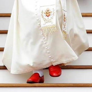
Miranda chose a pair of red, patent leather flats.
I have to admit that when I saw the shoes, I immediately thought of Pope Benedict....
But she decided to go with plaid.

You can see the care she is taking to match the seams on the side, however, I think she made some fatal flaws.
1. See the dark green fabric on the table? She had originally wanted to produce all or part of the top out of it. Tim talked her out of that. That ate up design time she really needed.
2. Once again, her top was an afterthought. It was sloppy and too casual.
3. The plaid had too much red in it, so the shoes got lost in the shuffle.

The judges kept saying that "it looked like Christmas." While that makes for a clever sound byte, the critique is too imprecise. Why did Alexander's pants work and Miranda's not? Because Alexander's pants were the only pop of color. Pope Benedict understood that you only need one pop of color.
I thought the judges were a little too harsh with the "nerd" label. Yes, this looks a bit "nerdy" but not because it is conservative or safe or even poorly fitted. It looks nerdy because these are pieces that don't belong together. Miranda knows how to tailor clothes. She needs more time and space than this competition provides to pull together flattering outfits.
The jacket isn't bad. If the top underneath had been more fitted and the plaid had not been so red, this could have been solidly safe, Miranda would be with us another week and Jeremy would not continue to annoy me.
So, while its sad to see Miranda go, she appears to be doing well with her clientele in Milwaukee and has even mended fences with her Milwaukee neighbor, Timothy.
Next, we have the tale of two little black dresses.
It's funny that neither Dom nor Miranda was familiar with the Coco Channel quote about the little black dress...because the LBD turned out to be the winner this week.
Ken
No doubt, Ken thinks he should have won this week.

The fabric was stunning--it had body and texture but was still light. The top was chic and modern. This peplum was smartly gathered. If the skirt had been just a little longer and the shoulders just a little less tight, this could have won the challenge. Still, he turns to peplum again and again in his designs. It is starting to be a crutch. I do think this would have showcased Alexandria's gladiator boots far better than her outfit did. It didn't win because this week, it really did get down to the details...and the judges were trying to prove a point.
Helen
I've been ready to give Helen the heave ho from this competition because I just can't figure out her design vision. What she has produced thus far in the competition doesn't resemble anything she originally showed the audition panel. Still, she entered this challenge with the right attitude--let the shoes do the talking and focus on impeccable tailoring.

The result, while frustrating for us to look at on the runway, was exactly what the judges wanted to see this week.

It is a dress and cape combination, which you saw for a brief moment on the runway.

The model isn't even facing the judges.
The judges wanted to communicate to the designers that when you have an accessory that presents its own strong image, you do not want the dress to overpower it. The dress should amplify it or simply provide an impeccable backdrop. Was Helen's dress the best design out there? You can debate that amongst yourselves. Was it the best design for this challenge? The judges certainly thought so. It may have been the only design that could have plausibly worked with every shoe on the runway this week...although it would have had to be hemmed up for Alexandria's gladiator boots.
That's all for this week. Next week, the orange man, Michael Kors, returns to the show. Who will win the battle of the quips? Michael or Zac? Stay tuned!
To me, the dress looked sloppy and cheap. Lace inserts are all the rage these days. This reminded me of t-shirts in the juniors section that you see with lace inserts and gobs of glitter. Hard and soft isn't the only contrast that could have been done with these boots. You could have done a contrasted the wild boots with a conservative suit or well-tailored dress. That might have been her key to another win. I just don't think with the time allotted, Alexandria felt she could be that ambitious. Her aesthetic involves complex shapes and silhouettes. She went for the simple and nearly got the win. But in the end, as celebrity judge Kaley Cuoco said...
 |
| "That design was really all about the boots." |

Dom

Dom continues to impress me, week after week. She chose some old-school kicks and highlighted all of the colors. Both were bold, unconventional choices. What kept her safe was that she used a quilting effect on the fabric, which unnecessarily added bulk. These were shoes that were really calling out for separates, in my opinion. Had Dom designed a cute jacket/shorts combination, the judges may have embraced this more warmly. She did the best with her time constraints, however, I worry that without feedback from the judges, she may turn to this quilting technique again. As we will see, this was not the challenge in which to trot out your fancy sewing techniques.
Jeremy
Jeremy's starting to grate on my nerves. He's overconfident about his design skills. He chose the boots, but instantly began talking about the sewing technique he was going to be using as if this weren't a challenge focused on the shoe. I believe he would have done the "cable knit sweater out of chiffon" regardless of the dictates of the challenge.
 |
| "Chiffonzie..." |

The judges saw "Pretty Woman." Wrong movie. Think "Flashdance." The top was a mess of poorly sewn "cables" and weird knit trim.
Bradon

Bradon chose a glittered, beige peau de soie flat. It inspired him to use a "bouillir" technique which drapes fabric in a way to make it look like boiling water. The same technique is used on the silk lining of casket and Liberace's capes. He was going to do an entire dress with the bouillir, which would have aged the model about 20 years. Tim talked him out of that. I was hoping he'd make a pair of palazzo pants. I was sending my best mental telepathy his way...but he chose a circle skirt instead. The effect still aged the model tremendously. To make matters worse, he stuck little doo-dads in the folds to mimic the glitter gobs on the shoe. They were necessary and it made the garment look cheap.
In the end, I think he realized that this technique is incredibly tricky to use and a little goes a long way. Had he just used the technique on the straps, let the top gather naturally and paired it up with some flowy pants, this would have been more successful.
Speaking of pants, we had the battle of the plaid pants.....
Alexander

Alexander started off this season swinging from one wild look to another. In these last two challenges he has really pulled himself together. The top is stunning and well fitted. It provides an interesting contrast with the pants. The flat front was a smart design, however, the pants are just a bit too tight. He ran out of time with the fitting and piecing and had to scramble to sew the model into the pants.
Miranda
Miranda chose a pair of red, patent leather flats.
I have to admit that when I saw the shoes, I immediately thought of Pope Benedict....

But she decided to go with plaid.

You can see the care she is taking to match the seams on the side, however, I think she made some fatal flaws.
1. See the dark green fabric on the table? She had originally wanted to produce all or part of the top out of it. Tim talked her out of that. That ate up design time she really needed.
2. Once again, her top was an afterthought. It was sloppy and too casual.
3. The plaid had too much red in it, so the shoes got lost in the shuffle.

The judges kept saying that "it looked like Christmas." While that makes for a clever sound byte, the critique is too imprecise. Why did Alexander's pants work and Miranda's not? Because Alexander's pants were the only pop of color. Pope Benedict understood that you only need one pop of color.
I thought the judges were a little too harsh with the "nerd" label. Yes, this looks a bit "nerdy" but not because it is conservative or safe or even poorly fitted. It looks nerdy because these are pieces that don't belong together. Miranda knows how to tailor clothes. She needs more time and space than this competition provides to pull together flattering outfits.
The jacket isn't bad. If the top underneath had been more fitted and the plaid had not been so red, this could have been solidly safe, Miranda would be with us another week and Jeremy would not continue to annoy me.
So, while its sad to see Miranda go, she appears to be doing well with her clientele in Milwaukee and has even mended fences with her Milwaukee neighbor, Timothy.
Next, we have the tale of two little black dresses.
It's funny that neither Dom nor Miranda was familiar with the Coco Channel quote about the little black dress...because the LBD turned out to be the winner this week.
Ken
No doubt, Ken thinks he should have won this week.

The fabric was stunning--it had body and texture but was still light. The top was chic and modern. This peplum was smartly gathered. If the skirt had been just a little longer and the shoulders just a little less tight, this could have won the challenge. Still, he turns to peplum again and again in his designs. It is starting to be a crutch. I do think this would have showcased Alexandria's gladiator boots far better than her outfit did. It didn't win because this week, it really did get down to the details...and the judges were trying to prove a point.
Helen
I've been ready to give Helen the heave ho from this competition because I just can't figure out her design vision. What she has produced thus far in the competition doesn't resemble anything she originally showed the audition panel. Still, she entered this challenge with the right attitude--let the shoes do the talking and focus on impeccable tailoring.

The result, while frustrating for us to look at on the runway, was exactly what the judges wanted to see this week.

It is a dress and cape combination, which you saw for a brief moment on the runway.
The model isn't even facing the judges.
The judges wanted to communicate to the designers that when you have an accessory that presents its own strong image, you do not want the dress to overpower it. The dress should amplify it or simply provide an impeccable backdrop. Was Helen's dress the best design out there? You can debate that amongst yourselves. Was it the best design for this challenge? The judges certainly thought so. It may have been the only design that could have plausibly worked with every shoe on the runway this week...although it would have had to be hemmed up for Alexandria's gladiator boots.
That's all for this week. Next week, the orange man, Michael Kors, returns to the show. Who will win the battle of the quips? Michael or Zac? Stay tuned!